Sunday, April 24, 2011

Stem and Leaf plot

Steam and Leaf plot

A stem and leaf plot is a graphical way to display statistics and gives the reader a quick representation of the distribution, shape and density of the data. In statical terms, the mode and outliers are easily identified by just looking at the chart. Stem and leaf plots, like the one above, uses the first significant digit as the "stem", divided by a line, and the second significant digit as the "leaf." Each stem is only listen once, but a leaf digit could be repeated if a number is duplicated. 

Box plot

Box plot
A box plot graphs numerical data through 5-number summaries; the smallest observation, lower quartile (Q1), median (Q2), upper quartile (Q3), and largest observation. The three quartiles are marked with a box, and the smallest and largest observations and marked with the end points of the line. The spacings between each box can differ depending on the degree of dispersion and skewness of the data. 

Histogram

Histogram
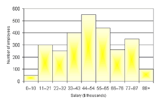
Histograms are used to display the distribution of data and the probability of a continuous variable. They also predict the density of the data, with the total area always equaling 1. Consistent intervals are marked on both the x- and y- axis, which shows equal frequencies of observations. This example is showing the relative number of employees a business has and the salary that each employee (on average) makes. It predicts that those working in companies with 500+ people, are only making half the salary as those with 10 or fewer, or 88 and more employees.

Parallel Coordinate Graph

Parallel Coordinate Graph
Parallel coordinate graphs are used analyze multivariate data and the geometry of multidimensional problems that are not satisfied by our 3D perceptions. It displays a group of lines containing a set of points separated by equally spaced vertical lines. This is an example from Alfred Inselberg, who invited the parallel coordinate who says this coordinate system can be applied to air traffic control, visual data mining, and interactive models of other complex systems.

Triangular Plot

Triangular Plot
Triangular plot, also known as a ternary plot, depicts the ratios of 3 variables which sums to a constant (1.0) that is positioned in an equilateral triangle. A lot of times it is used in physical sciences to show the relations between species and substances. The example above shows the data plotted in 3 bivariate cross-plots (AB, BC, AC) which translates onto the triangular diagram, where means and standard deviations are calculated. 

Windrose

Windrose
The windrose is used by meteorologist when graphing weather conditions and the wind speed and direction at a specific location. The different colored bands represent the wind ranges. The direction of the winds with the longest band shows the wind direction with the greatest frequency. Typically windroses will use 16 bands, each representing a different cardinal directions- but can be subdivided into as many as 32 directions. A practical application is the importance of a windrose when construction an airport runway, as wind speed and direction effects airplanes take-offs and landings. 

Climograph

Climograph
Climographs are used to show climatic temperatures and precipitation of a certain area. This example of a climograph show the precipitation and temperature levels in Guam, graphed by month from January to December. Although there was a lot of variation in the precipitation levels, the temperature stayed relatively stable. 

Saturday, April 23, 2011

Population Profile

Population Profile
Population profile is a graph analyzing the extent to which a group of people exhibit a certain quality or characteristic. Both x- and y- axis are labeled with the analyzing factor range, and the graph consists of horizontal bars. This example looks at the amount of immigrants into the United States in 2004, separated by male and female and their ages. The graph analyzes the potential change in demographic transition; it shows that more than half of immigrants entering the country are 25-39 years of age. 

Scatterplot

Scatterplot
Scatterplots uses a coordinate plane to display two variable for a set of data. Marked as a collection of points, each point has a value of two variables- one from the x-axis and one from the y-axis. The collection of points are related to each other in what is known as the correlation- positive (rising), negative (falling) or uncorrelated (completely scattered). This example is for an experiment that is measuring a explanatory variable and a response variable, having a positive correlation. 

Index Value Plot

Index Value
Index value plot does not show absolute values, but instead an index of measurements. This example is of the air quality index value for statistical areas, showing the overall quality of air concerning all available pollutant measurements. 

Accumulative Line Graph or Lorenz Curve

Lorenz Curve
Accumulative line graph, or Lorenz curve, is a graph that shows the degree of inequality between two variables distributions. The slope can be measured which will determine the value of the difference between the two variables. Because the lorenz curve combines the values in each category, it is not comparing the two to each other but instead considers the whole graph and increasing or decreasing. 

Bilateral Graph

Bilateral Graph

A bilateral graph compares 2 or more variables side by side, relative to a bar graph. This example has a x-axis regarding the fiscal years and the y-axis is counting the number of people. The data in the graph is measuring the acceptance of trainees, dispatch of experts, and dispatch of JOCVs. 

Nominal Area Choropleth Map

Nominal area Choropleth map
Nominal area choropleth maps are maps that represent nominal values, measured in amounts but not in an actual value. In order to show the information accurately, data is usually given in quantitative values. This is an example from the presidential election in 2008 and the predictions of the states being "blue" or "red." This specific map determined the democrats would win just based on the information in the media or other forums. 

Unstandardized Choropleth Map

Unstandardized Choropleth Map
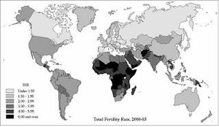
Unstandardized choropleth maps use data with raw sets of numbers. These raw numbers represent the total value and are not averaged together. This example is a representation of total fertility rates from 2000-2005 in the nation. The legend explains that the lighter shaded continents have lower fertility rates than the darker shaded continents. 

Standardized Choropleth Map

Standardized Choropleth Map
Standardized choropleth maps are used to compare the distribution among an area, usually shaded to demote the difference and variance. In this example, the map of Canada is comparing the population percentage of 14 year olds and younger in 2006. The lighter the shading the lower the population, and the darker the shading the higher the percentage. 

Univariate Choropleth Map

Univariate Choropleth Map
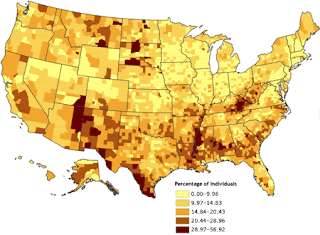
A univariate choropleth map only displays one set of variables or data. Again, different shades of colors are used to represent the difference between each category. This example represents the percentage of individuals living in poverty in 2000, classified by county.

Bivariate Choropleth Map

Bivariate Choropleth Map
Bivariate choropleth map shows two separate variables and data sets regarding a certain issue. Usually, different colors are used to shade and decipher the difference in the variables. This example of a bivariate choropleth map shows Russia's population density in 2002 regarding percentage of population change from 1989-2002 and Russia's central federal district.

Unclassed Choropleth Map

Unclassed Choropleth Map
Unclassed choropleth map is a unique technique in that it does not necessarily assign the data to any form of classification or grouping. Instead, continuous color schemes and shading are used to correlate the data to the values. This example shows this color scheme and the related values on the continuum. 

Classed Choropleth Map

Classed Choropleth Map
A classed choropleth map provides visualization of how a measurement varies across an area, or the level of variability across a region. Shading is used to show this proportion of statistical measurements. Having too many classes for a map can make it more difficult to read and the colors can distort the actual information; 4 or 5 classes is usually enough. This choropleth map shows the amount of spending by overseas residents in 2003.

Range Graded Proportional Circle Map

Range graded proportional circle map
A range graded proportional circle map uses circles to group the data into circles, keeping in mind their relative sizes that depicts the data being displayed. Circles are used because they are easy to scale and measured using the radius. This example shows the population of Europe by country, by using relatively different circle sizes in the map, you can easily distinguished the different populations.

Continuously Variable Proportional Circle Map

Continuously variable proportional circle map
A continuously variable proportional circle map uses circles to show the proportion of quantities or frequencies, which is shown by the size of the circle. The size of the circle reflects directly the value of the data, and not just a range of data. As you can see in this example, the different sized circles represent different proportions of data as each circle is a different pie chart. 

DOQQ

DOQQ
DOQQ, or digital orthophotos quadrangle, is a computer generated image of an aerial picture that has been removed of any large displacements. This type of imagery is unique because it is a combination of characteristics of a photograph and geometrics of a map. This image has been produced by the USGS and is a natural colored picture. 

DEM

DEM
DEM, or digital evaluation model, is an image that shows the elevation of the earths surface which can be used to create digital models and representations of maps and 3D images. Often times remotes sensing is used to gather data to build such images. This example shows the 3D graphics for the GIS and the multilayer map that uses transparencies to signify the important characteristics and trends. 

DLG

DLG
DLG is a digital line graph that represents digital vector data, depicting a variety of information using contour lines. DLGs are used for a variety of features and attributes, and exist in three different scales including small, intermediate and large. This is an example using the USGS DLG mapping system which is a picture of natural boundaries and transportation routes including roads, trails, and railroads. 

DRG

DRG
DRG, digital raster graphic, is a scanned image of a USGS topographic map. The image represents all georeferenced images on the surface of the earth. DRG's can be used to reference DLG's to collect, review and revise that data. This graph is an image of a river through a town in Colorado. 

Isopleths

Isopleths
Isopleths are used for contour lines that cannot be measured at any one point, but must be calculated from a collection of data points over an area. Each calculated value is the value of the variable at the center of that area. This isopleth is measuring the coastal wind velocity over the columbian river by month and latitude. Positive velocity are the winter and fall seasons while negative velocity is seen in the spring and summer seasons. 

Isopach

Isopach
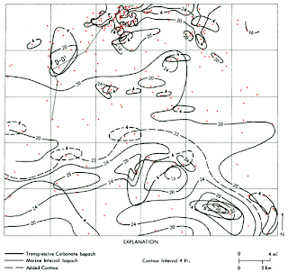
Isopach maps uses contour lines to map the variation of thickness of a stratum over a specific area. This specific isopach is picturing the apparent water resistivity that has been measured given a formula. The varying lines show the difference in resistance in the water stream. 

Isohyets

Isohyets
Isohyets are maps that uses contour lines to match areas or regions that have equal amounts of rainfall during a specific period. This map is showing three different regions and the long term average rainfall. It appears that region 2 is the one that varies the most, depending on the location (north-south) in that region. 

Isotachs

Isotachs
Isotachs use contour lines to map equal wind speeds. Lines and color variations can be used to show the appropriate speed and force of a wind. This is especially important in upper levels of the atmosphere, specifically in relevance to a jet stream. This image shows the dynamics of those upper level wind developments, which occur rapidly in instances like winter storms.  

Isobars

Isobars
Isobars uses contour lines to connect points of equal atmospheric pressure. These lines are generated from sea level pressure means, and the pressure value is given in millibars. Isobar maps are readily available almost every hour, because sea level and atmospheric pressures is constantly changing. Strong winds can also affect the atmospheric pressure with larger gradients. 

LIDAR

LIDAR
LIDAR or light detection and ranging, is an optical sensing technology that measures the distance to or from properties by illuminating the target with light, often using a laser. This example is SAIC, an urban modeling system using detail urban features contained in LIDAR data to support new up and coming projects and mission planning. 

Doppler Radar

Doppler Radar
A doppler radar is one of the most well known systems that a meteorologist uses; it is a radar that gives a doppler effect by producing velocity data about objects at a distance. It sends microwaves towards a desired object and listens to the reflection, while analyzing the frequency of the signal returned and the objects motion. This is an example of a doppler radar image showing various weather conditions that are approaching Florida. 

Black & White Aerial Photo

Infrared Aerial Photo

Cartographic Animations

Cartographic animation is a dynamic visual that evolves in the changes of display, although it is not widely used. These animation can show change overtime, or display images back to back that provide the appearance of changing imagery. This example is one from the catastrophic event of hurricane Katrina in the middle of the Gulf. 

Statistical Map

Statistical Map
A statistical map is one which shows variation in quantity of a factor such as rainfall, population, etc. that affects a certain area. It represents this information by providing the number or value of the information as it is. 

Cartograms

Cartograms
Cartograms turns a thematic mapping variable into a value for land area or distance, distorting the space so it can convey a different meaning for this alternate variable. There are two main types of cartograms- area and distance cartograms. Above is an example of an area cartogram of the United States, which shows each county rescaled in proportion to its population. 

Flow Map

Flow Map
A flow map is a somewhat mix of a map and flow chart, because it shows the movement of objects from one location to another. It considers what is flowing, moving, or migrating; the direction its flowing and the what the destination is; how much is being transported. This map shows the total combined truck flows from Texas to the rest of the United States. 

Isoline Map

Isoline Map
An isoline map is one with continuous lines joining points with the same value. It is used to interpret some meaning and information of a thematic map. It describes some sort of distributions on a map, and often uses a color or pattern to do so. This example is a common one form the evening weather report, which shows a forecast of winds (mph) for a day. The lighter blue the lower the winds, and the darker blue the high the winds. 

Proportional Circle Map

Choropleth Map

Dot Distribution Map

Dot Distribution Map
A dot distribution map, or dot density map, uses a dot to symbolize a point of an occurring feature or phenomenon. It shows spatial patterns by relying on visual scatter to determine the density of dots. In this example, the more dots and darker the purple color, the higher density and reoccurring presence of any characteristic in questioning. 

Propaganda Map

Propaganda Map
Propaganda maps are used to display art or images that are not necessarily true, but represent falsified information or advertising. This example is one of the United States, picturing Texas as being 2/3 of United States as far as land area. This obviously is not the case, but in some people's minds this is how this state is viewed. 

Thursday, April 14, 2011

Hypsometric Maps

Hypsometric Map
Hypsometric map is used to represent the different elevations of the earth by contours, shading, tinting, or batching. There are different rules depending on the image of which colors and gradients should be used. This example is a digital elevation model that helps cartographers generate the color classes easily, which generate hypsometrically colored maps. 

Cadastral Maps

PLSS Map

Wednesday, March 23, 2011

Thematic Map

Thematic Map

A thematic map focuses on a specific theme around a geographic area. The themes can include physical, social, political, cultural, sociological or agricultural concerns. It can be for a specific community or city, or span to a nation or continent. This map shows the pollen seasons involving grass, tree, ragweed and weed pollen; the whole United States is shown and labeled according to the specific months in pollen season. 

Thursday, January 27, 2011

Topographic Map


Topographic Maps are used to show three-dimensional surfaces such as earth, by using contour lines to express elevation changes. For example, mountains are picture by imagining a flat horizontal line that has been sliced through the mass. Each quadrangle has a name and is printed on the map to easily located neighboring pieces of land. There is also a scale that shows the grid, interval, and declination on the map.

Wednesday, January 26, 2011

Planimetric Maps


Planimetric Maps are defined by using horizontal lines to accurately predict the distances between features. This type of map shows geographic objects, physical features, and structures such as roads, buildings, and water masses. Planimetric maps express detail in highways, sidewalks, railroads, bridges, etc.; however, it is hard to determine the level of elevation of objects. It can also be referred to as a line map.